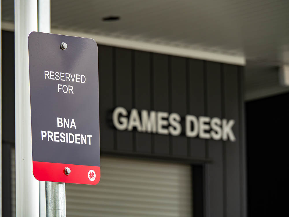
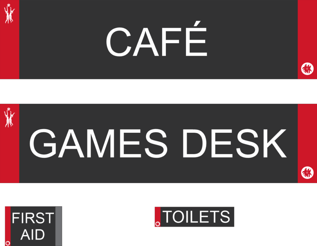
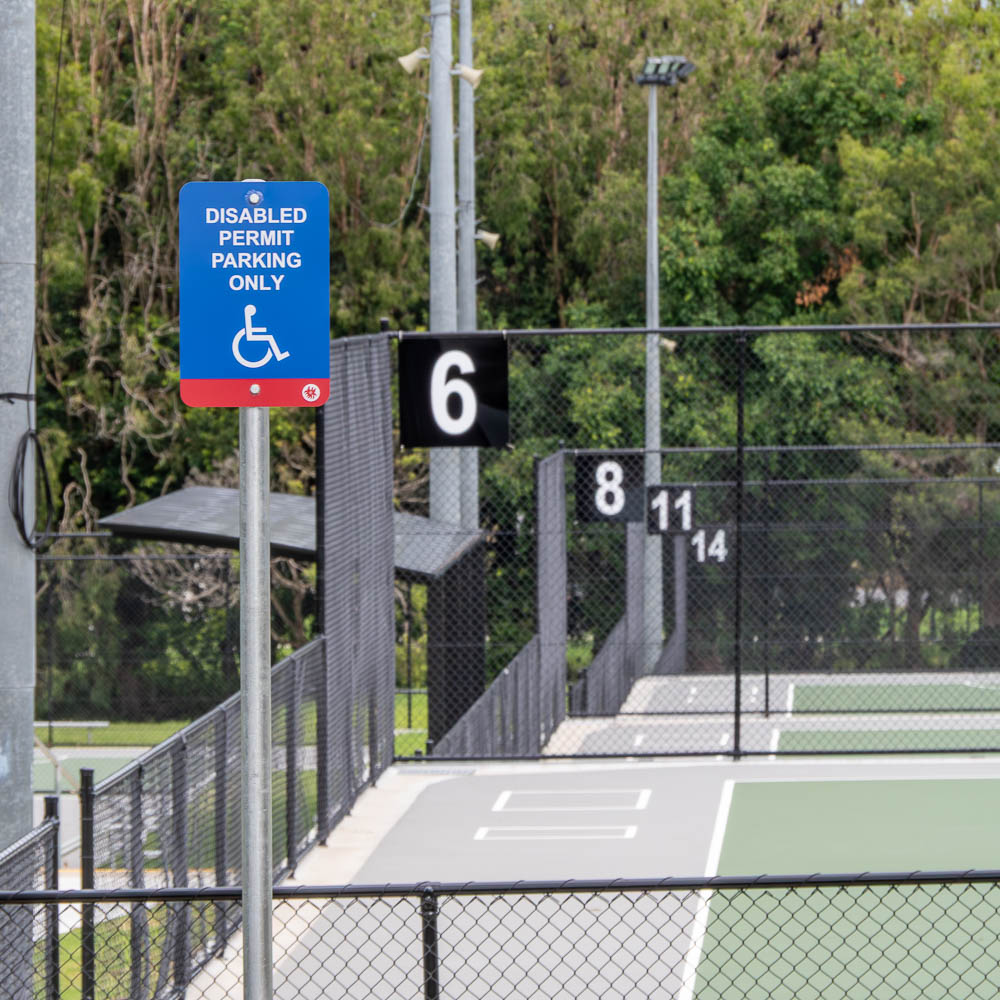
As part of the Brisbane Netball Association’s $7.9 million facility redevelopment, I designed a comprehensive signage and wayfinding system for the upgraded venue as part of my role. The project began with very limited existing brand assets—only a non-vector version of the BNA logo was available—so the logo first had to be carefully redrawn as vector artwork. With this as the starting point, I developed a simple and consistent visual approach that could be applied across the entire site.
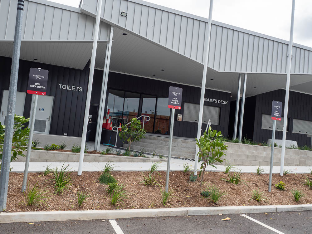
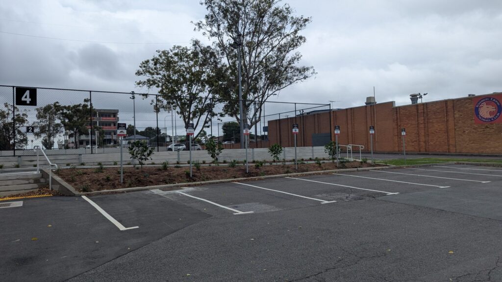
The architectural palette of the new complex, particularly the Monument Grey building finishes, influenced the overall design approach. I used the association’s red as the primary accent colour, creating a strong contrast against the darker surroundings while keeping the designs minimal and highly legible. The aim was to ensure visitors, players, and spectators could quickly orient themselves in a busy sporting environment while maintaining a cohesive look throughout the facility.
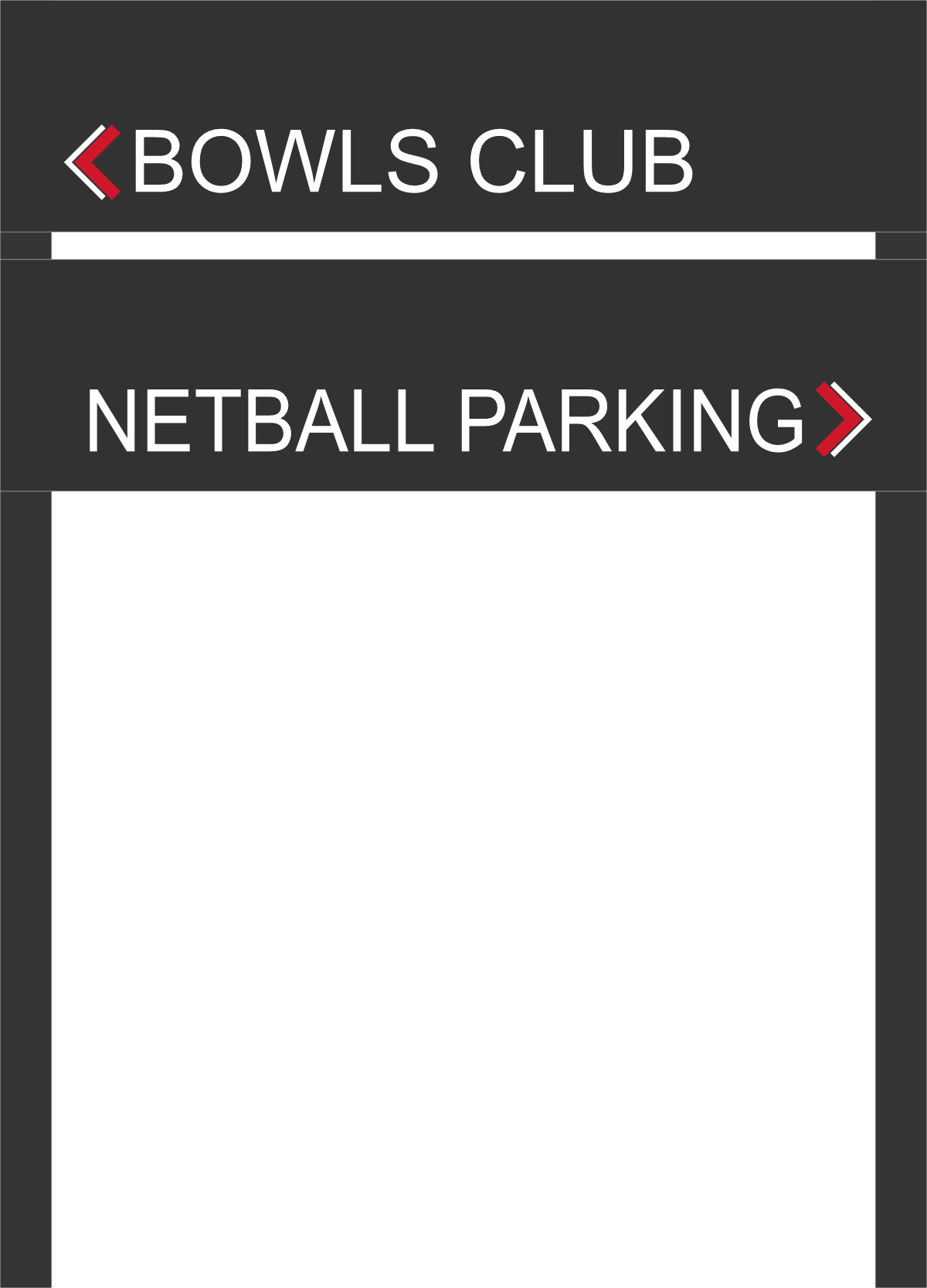
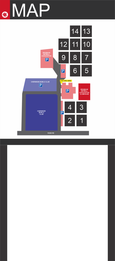
The final system covers court identification, maps, parking directions, clubhouse areas, and general wayfinding across the site. Rather than relying on decorative elements, the design focuses on clarity, hierarchy, and consistency, allowing the signage to function effectively while still reinforcing the association’s identity. The result is a clean, modern signage system that supports the upgraded venue and provides a unified visual presence across the entire complex.